Unusuals
Brochure for Artificial Intelligence-Enhanced Video Surveillance
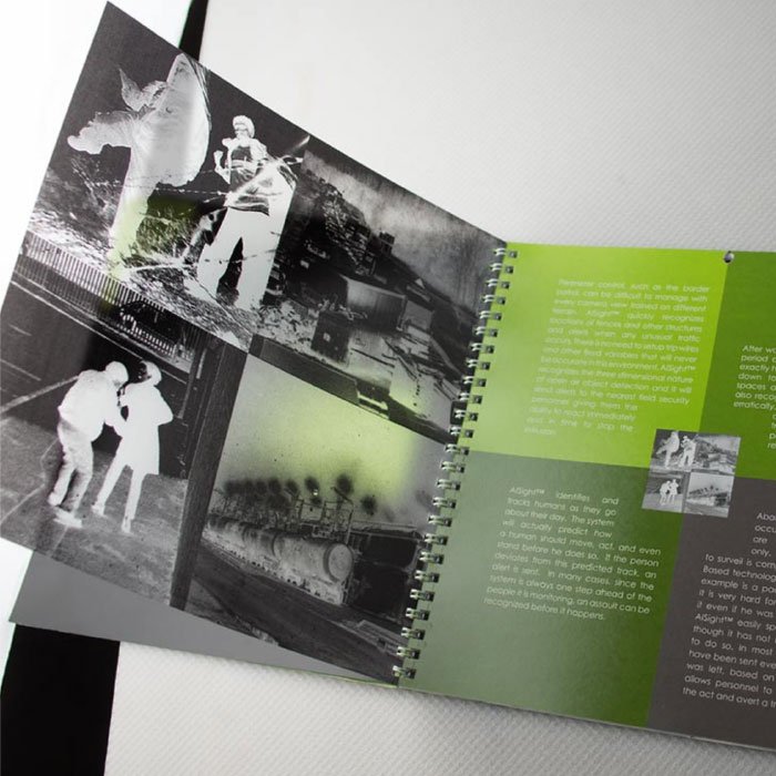
How do you get across the idea of layers of intelligent video surveillance products in a printed brochure? This company developed software that learned what was every day and what was out of character for each camera’s view and time frame. We created a sense of urgency by using acetate printed as film negatives showing ominous scenes of crime taken from video cameras. We slipped a card in the back containing footage and much more detailed information. The coil binding gave solidity to the ideas in this hefty brochure.
Vanguard Brochure
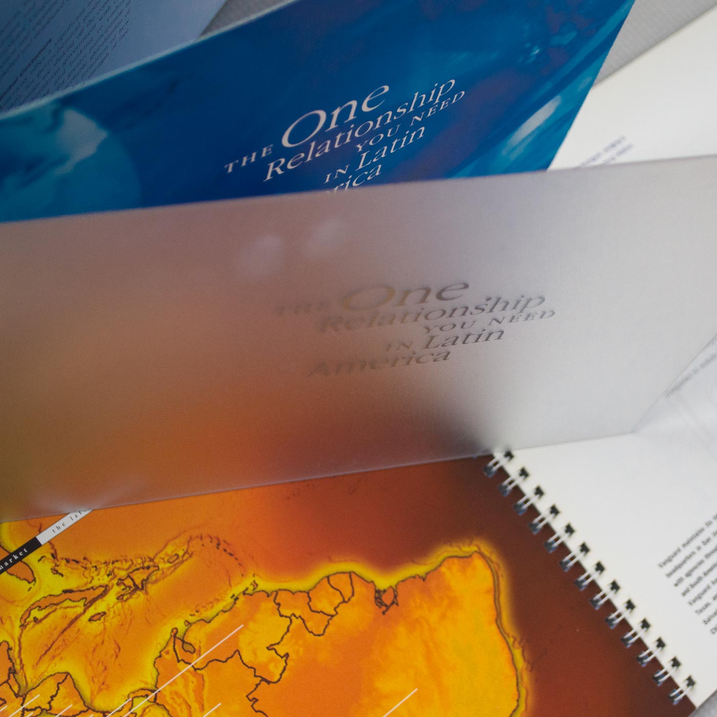
We love this brochure because it’s so unique. Thank you Vanguard for letting us be so creative. Vanguard is a company that works with large oil companies. They buy their excess plastic materials and sell them to companies in Latin America. They only have a handful of clients and prospects. This piece was designed to give them credibility and share with their prospects the in-depth knowledge they have about the Latin American market. We used a plastic cover since this is the primary product they export. The cover is silk-screened with the words. Spiral-bound and a unique size: 12 x 8.
Construction Firm Brochure
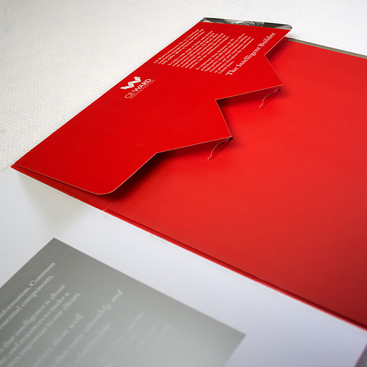
This is the corporate brochure for CE Ward (which eventually became JE Dunn). The last page (red) is also a pocket folder with a flap to complement the logo.
Where to begin...
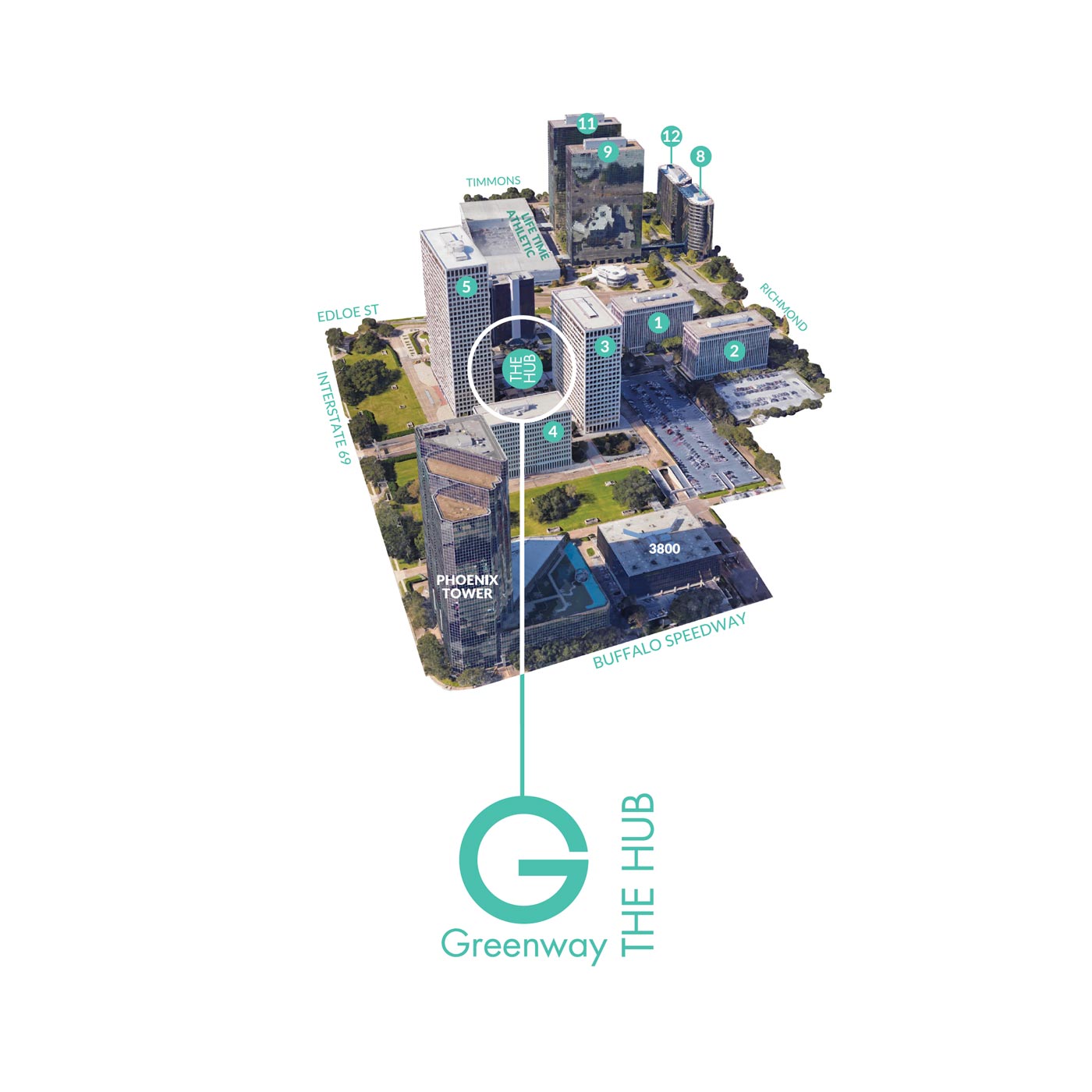
Parkway is Houston’s premier owner, operator, leasing of Class A Buildings. They own and operate all of Greenway Plaza, Post Oak Central, City West Place, and San Felipe Tower. We have the privilege of working with their amazing Marketing & Leasing Team to get the word out. Over the years, we’ve done many fun projects. Thank you Parkway Team for letting us be your partner.
This brochure tells the full story of why you want to office at Greenway Plaza. It’s several pages but designed in such a way that you never feel overwhelmed.
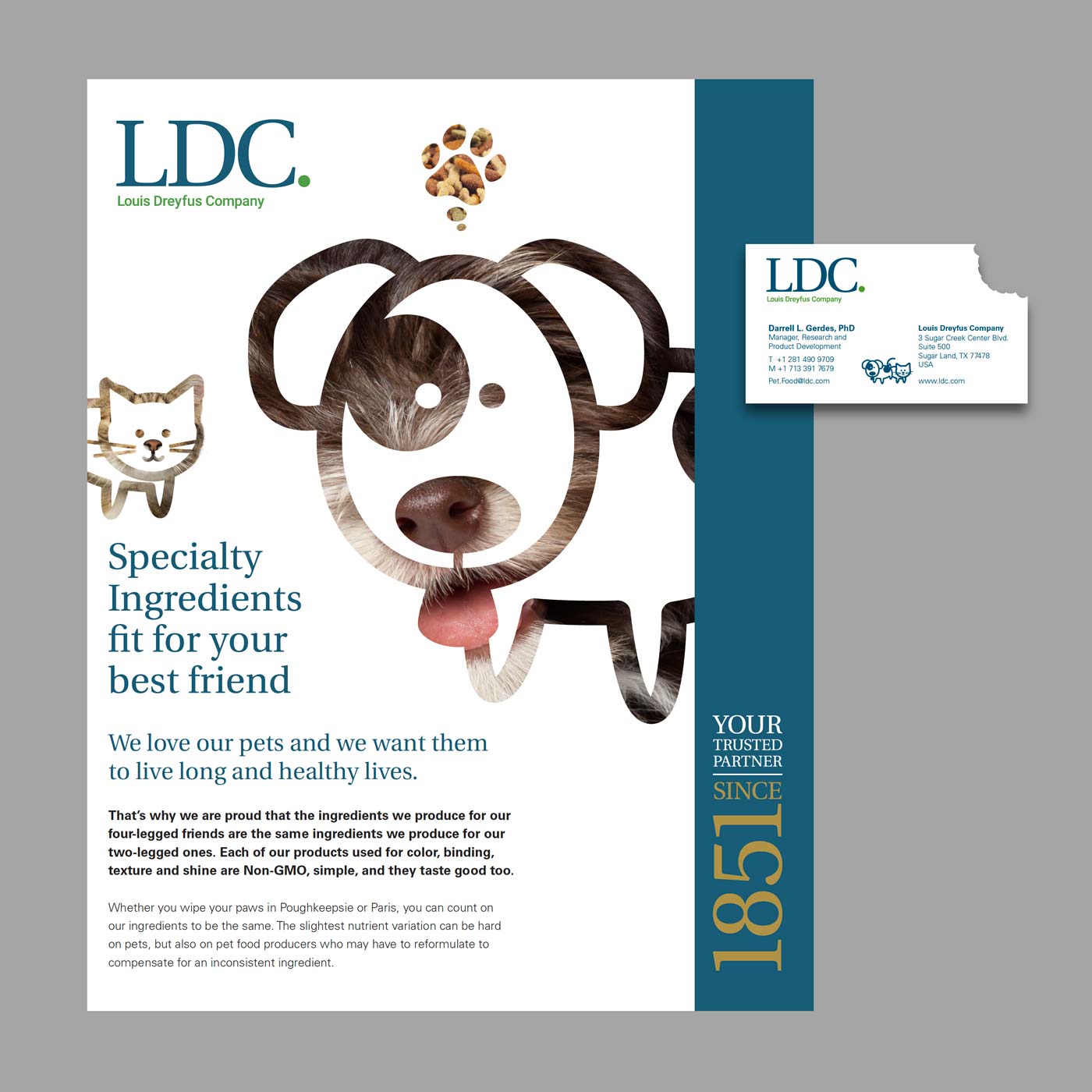
LDC (Louis Dreyfus Company)
LDC is the parent company of Imperial Sugar and Dixie Crystals Sugar. Over the years we’ve gotten to work with LDC’s R&D Department to help with their trade shows and events. This is an event business card and a 2-page spread in their pet food brochure. We die-cut the business card so it looks like a bite has been taken out of it. Too fun!
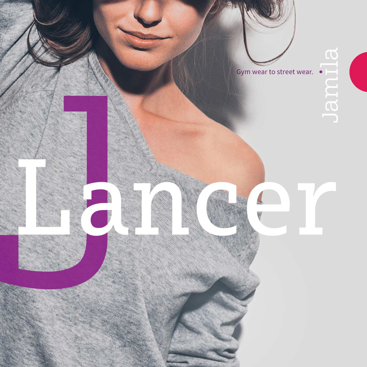
Fashion brochure
Jamila is an athleisure wear company that works with “JLancers” through social selling to outfit women in comfortable, fashionable, high-quality clothing. They utilize the clothing line as a tool and business model to create the opportunities that lead to empowerment, income, prosperity, confidence, leadership, wisdom, risk, reward, experiences, growth, fun, abundance, acceptance, achievement, and beauty. This magazine introduced the current fashion line and business concept to these “JLancer” entrepreneurs.
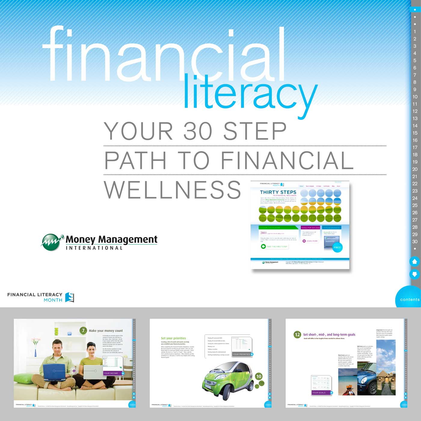
Financial Literacy e-Brochure
We’ve been working with Money Management for at least 15 years. We love them and their team and the wonderful work they do helping others take charge of their lives. This is an eBook for Financial Literacy. The eBook is a PDF with linked navigation so that you can link quickly to any page or link within/outside the story where applicable.
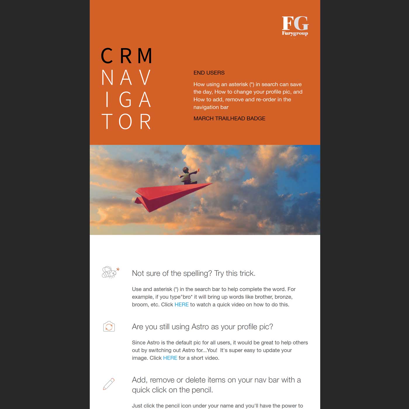
CRM Navigator Email Newsletter
Unique newsletter for a unique company, The Fury Group. They solve problems, give peace of mind, and help companies improve in many ways via Salesforce.com. As Houston’s premier Salesforce implementation and integration partner, they truly are the ultimate CRM navigator.
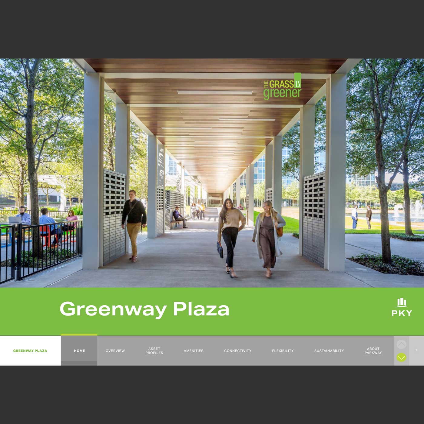
Greenway Plaza Property Print and e-Brochure
Just one of Parkway’s many outstanding properties — Greenway Plaza is a 52-acre master-planned, mixed-use development with 11 buildings and roughly 4.9 million square feet of office space situated between Downtown Houston and The Galleria. This 48-page perfect-bound print brochure tells their story beautifully. Reformatted into an e-Brochure with navigation links.
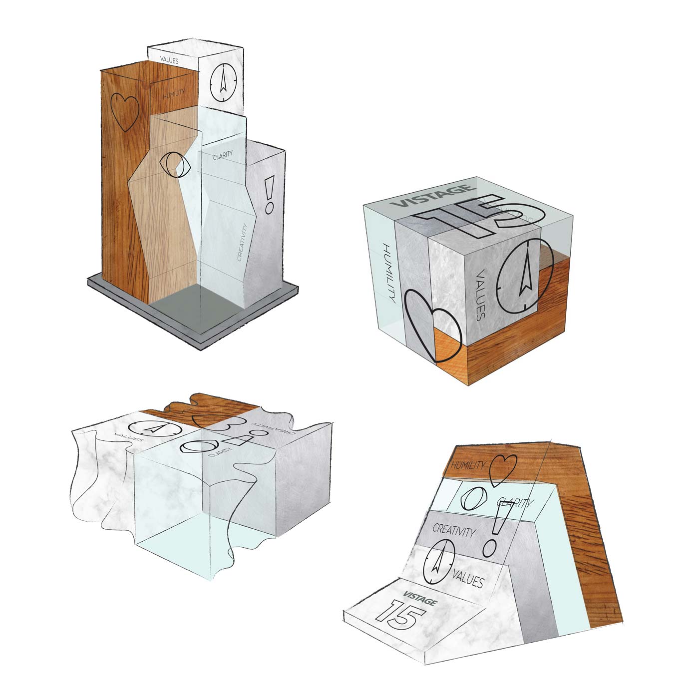
Award concepts
Graphic design sometimes goes 3D. We proposed concepts for an award system for this leadership organization. Four materials – wood, stone, metal, and glass – represent four values the founder wanted to instill in the organization’s DNA.
Tall Column-ish Design: The marble stone in the back would be a simple rectangular shape, while the wood and aluminum would have slices taken away from their block shapes. The acrylic would be cast. Two textures on each block, most faces are smooth, but one face on each would be rough – again to speak to the unfinished nature of goals yet to be attained.
Cubbed Design: This 4-piece puzzle would have “surface” graphics that overlap adjacent pieces. The marble piece is simple, the wood and aluminum have corners taken out of rectangular blocks, and the acrylic would be cast.
Abstract Wave Design: This set of 4 blocks with waves subtracted from one side would speak to the fact that success is always a work in progress, that things are ever-changing, and while the award reciepient is 15 years in, there are unfinished goals to come. So there are two textures on each cube. Surface graphics would be on the top surface, and they are overlapped onto adjacent pieces.
Stack Design: This stack of materials would get surface graphics on the front face-plane that they have in common. Two textures per piece to speak to yet-to-be attained goals.